PRINT Magazine Summer 2017 Special Typography Issue
The type world can feel like the most brutally exclusive of clubs, which makes the annual Print typography issue a doozey for the editors. Whether it’s ensuring that a “typeface” didn’t slip through when “font” should have been used, or “type design” didn’t take the place of “typography,” Editor-in-Chief Zachary Petit is constantly keeping up with the minutiae of terms at any cost.
However this typography issue, with cover photo by John Keatley and typography by Louise Fili, is a bit different from past editions. Here, we dive into the turning tides of typography. Throughout the issue you’ll find voices advocating for “the strict adherence to classic terms,” while others advocate for everyone to “lighten up.”
Join the discussion, question the standards, give things a fresh look. Grab your copy of the Print Summer 2017 Special Typography Issue today.
FEATURES
Women of Words Meet 10 of the most talented female creatives living and breathing letters today. By Rebecca Bedrossian
The Top 25 20th-Century Typographers In this roundup, Print breaks down the elite group of typographers who have made powerful and lasting contributions to the American typographic language. By Steven Heller
The Art of the Glance Monotype and MIT’s Clear-IP research lab shows typography’s true power—and hoe designers can more effectively wield it for the greater good. By Jason Tselentis
Over/Under Paul Shaw shines a fresh spotlight on a dozen overlooked and underappreciated typefaces that, for years—and for various reasons—have been kept in the dark. By Paul Shaw
The Implausible Book For hundreds of years, the typography riddle dubbed the Voynich Manuscript has stumped scientists, baffled historians and confounded cryptologists. By Brandon Ambrosin
Tattoo Artist As Typographer? A manifesto and portfolio roundup of five artists who blur boundaries today. By Alex Harrell
UP FRONT
Grids + Guides A smattering of the latest from the world of design. By Callie Budrick
Evolution: Signs of the Times From skulls to “trespassers will be shot on sight,” warning signs are design at its most simple yet formidable. By Steven Heller
Observer: “Typographic Selfies”? Why Fonts Matter misses the mark on what really matters about type and design. By Rick Poynor
Design Matters: In Print After studying with a host of masters, Philippe Apeloig developed an incredible typographic style all his own. By Debbie Millman
IN BACK
Love Letters A tribute to the brillian Louise Fili in text and visuals. By Debbie Millman
Stereotype: The Reluctant Type Designer Print reviews Carol Twombly: Her Brief But Brilliant Career in Type Design. By Paul Shaw
The Last Word: Jesse James Dusting off the final moments of an outlaw legend. By Seymour Chwast
SKU PRSM17
AuthorThe Editors of PRINT Magazine
FormatMagazine
About Author

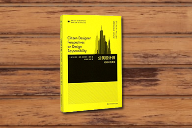 Citizen Designer Perspectives on Design Responsibility
 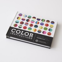 Color Inspirations More than 3,000 Innovative Color Palette Ideas
  Color Inspirations eBook More than 3,000 Innovative Color Palette Ideas
 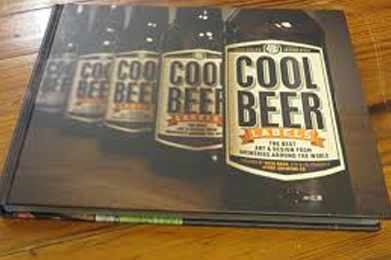 Cool Beer Labels eBook
 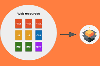 Cover Your (Web) Bases Bundle